The Good, the Bad, and the Ugly - Print Design Rules
Use this document to record your notes as you go around the different posters to identify the four areas of print design.
Colour

Composition


Layout


Text


Print design rule ideas
- Composition:
- Add balance when you add picture and texts
- Organising the text and the picture so people understand
- Layout:
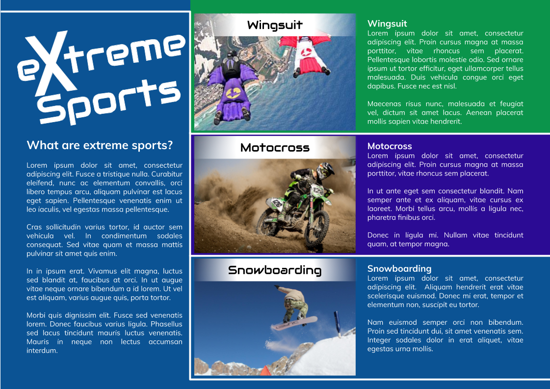
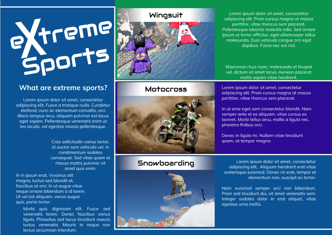
- Align the text and images
- Have margins
- Colour:
- Try not using clashing colours
- Use a harmonic colour scheme
- Text:
- The text has to have the same size and fonts
- Make sure the text is legible
Print design rule ideas
- Composition:
- Have a balance of pictures and sentences.
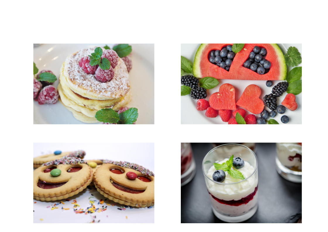
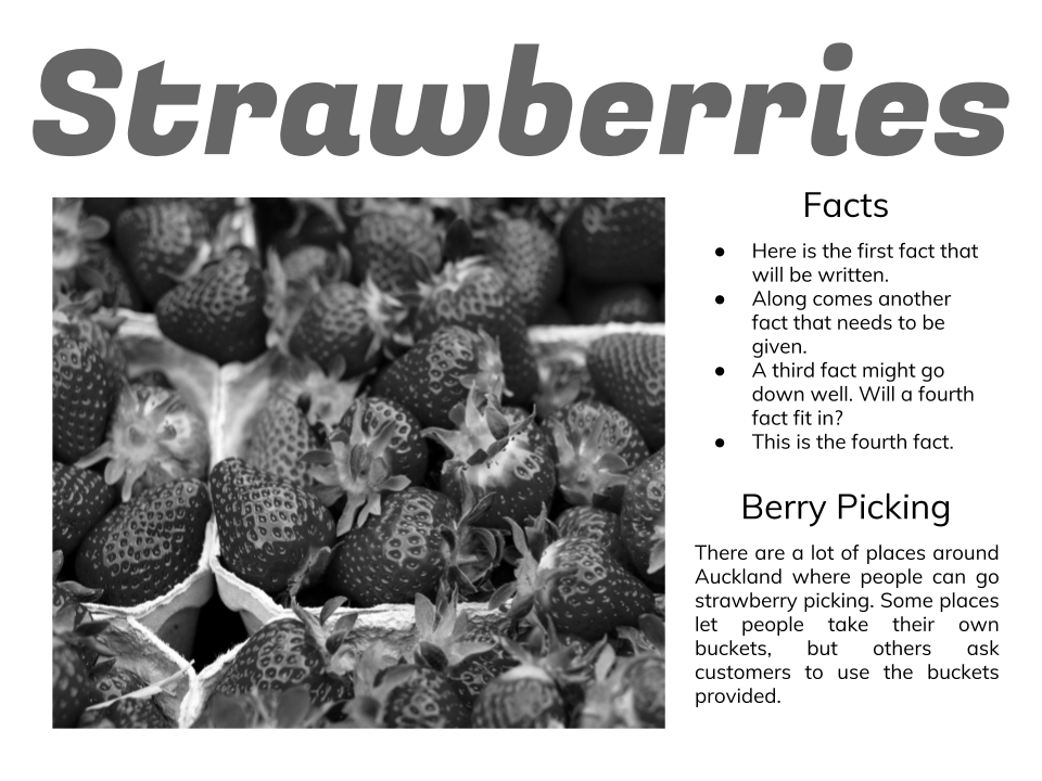
- Use images that relate to the text.
- Layout:
- Have margins and align the text and images.
- Use most of the space
- Colour:
- Don’t use clashing colours. Use a harmonic colour scheme.
- Use contrasting background and foreground colors.
- Text:
- Keep consistent fonts and sizes
- Make sure the text is legible.
.
Today we are looking at the areas of the print design rules. They are Composion, layout, colour and text. The print design rules help make you DLO's better.
Composion is having a balance of pictures and sentences. Layout is having margins and alingn the text and images. Coulours is using contrasting backrounds and foreground colours. Text is keeping consistent fonts and sizes.
If you use the print design rules your DLO will be better and other people who read it can under stand what your saying. If you don't use the print design rules it will be ugly and people will lose intrest.
No comments:
Post a Comment
Note: only a member of this blog may post a comment.